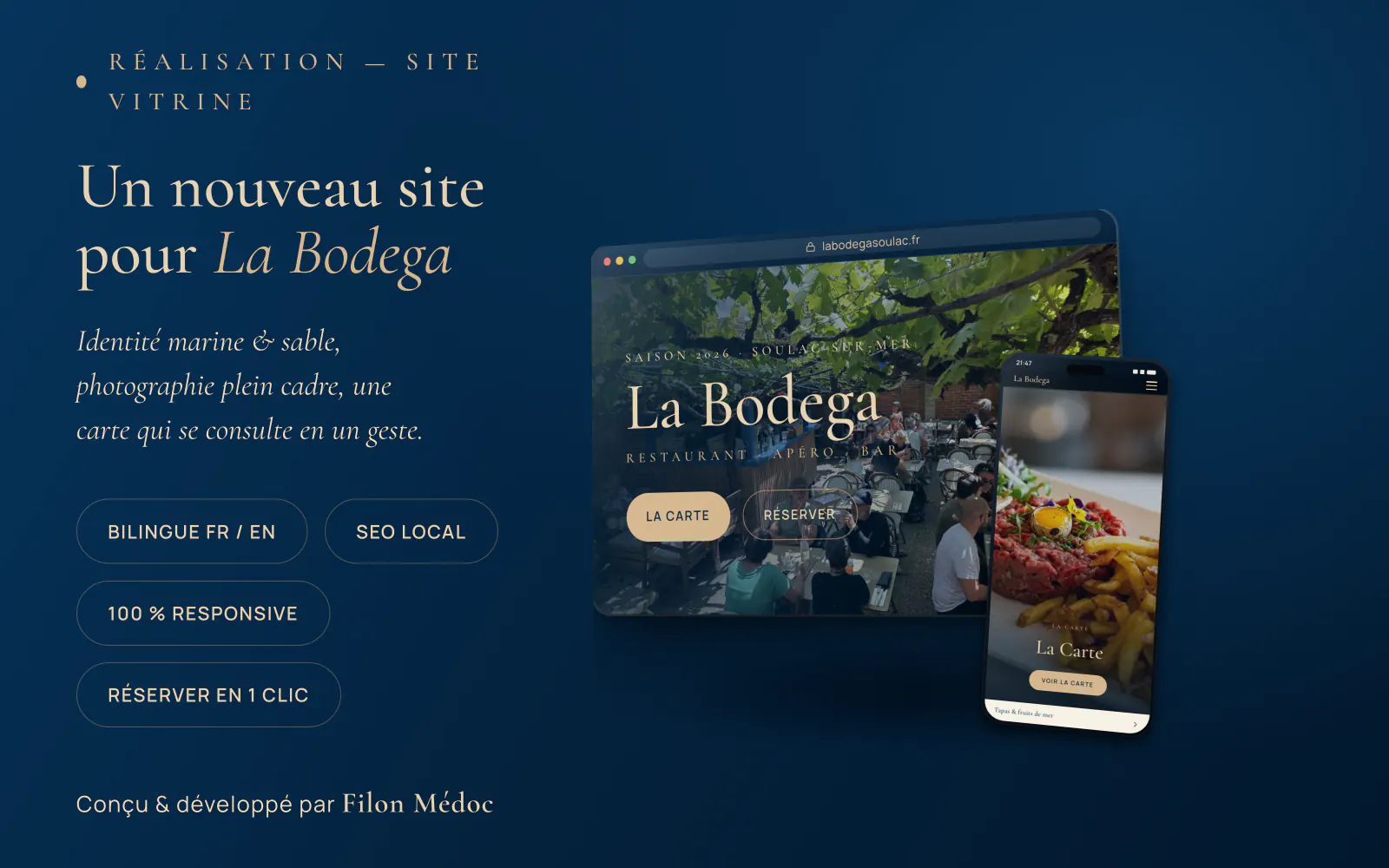
La Bodega is an address in Soulac-sur-Mer: restaurant, canteen, drinks spot, dance bar, all at once, under an arbour, a few minutes from the ocean. The place is open from April to October, until two in the morning, and its clientele changes completely with the season: Médoc regulars in spring, French and foreign holidaymakers at the height of summer.
Here is how we designed its site, and why each choice was made. The result is live: labodegasoulac.fr.
The real problem was not “having a site”
The starting point was not aesthetic. A seaside restaurant plays out on a very precise stage: it is 7.30 pm, a family is walking down the street, somebody gets their phone out and types the name of the restaurant, or simply “restaurant Soulac”. They have thirty seconds of attention, a middling connection, and three other places open in other tabs.
The whole site was built for that scene. Not to look pretty on a large screen in an office.
In practice, that imposed four things: appearing instantly on mobile, showing the menu straight away, making it possible to book without thinking, and existing in English for half the passers-by in August.
An identity, not a theme
First decision: La Bodega had to look like no other restaurant site. We started from what they already have, the deep blue of the ocean a few kilometres away and the sand of the coast, to build a marine and sand palette, carried through from end to end.
The photos are theirs: the arbour in late afternoon, the sharing boards, the tartare, the dining room in the evening. They fill the whole screen, with no frame and no unnecessary shadow. No stock library, no generic plate. A customer pushing the door open should recognise the place they saw on their phone.
The headings sit in a serif typeface, chosen for its “printed menu” feel, and the rest of the text in a crisp face that stays readable in full sun on a phone screen. Two tiny decisions, and exactly what stops a site looking like a bought template.
The menu, the most consulted element on the site
On a restaurant site, the menu is the queen page. It is the one people open before choosing.
So we turned down the most widespread solution, the downloadable PDF. A PDF on a phone is a file that loads slowly, that you have to pinch and drag to read a price, and that Google does not understand properly. Here, the menu is a real web page: you scroll it with a thumb, prices are readable without zooming, sections follow naturally.
Another advantage, less visible but decisive: search engines read the content of the menu. When somebody looks for tapas or a tartare in the area, there is something to find.
Booking: by phone here, online elsewhere
La Bodega takes its bookings by phone. That was the right choice for this place: a team that answers, a dining room they know by heart, and a volume that is very manageable by voice. The site’s job was not to change how they work, but to make the call obvious.
So the number sits at the top of every page and dials with a single tap from a mobile. Directions open the same way, in one gesture, in the visitor’s navigation app.
That choice is not universal, and that is the important point. As soon as the phone rings in the middle of service, some requests arrive after closing, or no-shows cost you covers, online booking becomes the module that pays back the most on a restaurant site. We then install it in yours, with your schedule, your slots, your capacity and your automatic confirmations. It runs while you are on the floor, including at two in the morning, and the bookings stay yours: no commission taken on each cover, no customer file belonging to somebody else.
So the right question is not “do I need a booking module?”, but “where are you losing customers today?”. We talk it through before writing a single line, and we install what answers that. The principle stays the same either way: the shortest path between the impulse and the action, because every extra step costs customers.
Two languages, properly
In season, a significant share of the clientele does not speak French. The lazy solution is to stick an automatic translation button in a corner. We did the opposite.
The site exists in two complete versions, French and English, each with its own address and its own text, written rather than machine-translated. A visitor whose phone is set to English lands directly on the English version, without having to look for anything, and can switch between languages whenever they want.
The benefit goes beyond reading comfort: a search in English and a search in French are two distinct markets for Google. With two separate versions, the restaurant is present in both, including for its late-night events, instead of being invisible in one of them.
Being found: the invisible work
Most of the search work does not show on the page. It consists of describing the establishment in a language search engines understand unambiguously: the type of establishment, the exact address, opening hours, cuisines served, the position on the map, the average rating and the number of reviews.
To that are added the foundations: a clean address for each page, titles built around what people actually type (“restaurant Soulac”, “tapas Soulac-sur-Mer”), a sitemap kept up to date and submitted to Google, and the two languages correctly declared in relation to each other.
The Google reviews are shown on the home page, with the real score and the real count. No flattering rounding: Google cross-checks what is displayed against its own listing, and an invented score is paid for in penalties.
Finally, the site is only half the work. The other half plays out on the establishment’s Google listing, the reviews collected in the dining room, and the links coming from local tourism sites. We support clients on that too, because a beautiful site nobody finds is no use.
The four scores, at maximum
Google provides a free public tool, PageSpeed Insights, which scores any site out of 100 in four areas: display speed, accessibility, build quality and technical search readiness. It is the same measurement Google uses to rank pages.
La Bodega scores 100 out of 100 in all four on desktop. On mobile, where the tool deliberately simulates an entry-level phone on a throttled network, the site keeps 100 for accessibility, best practices and search, and scores 98 for speed. That is rare, including on far more expensive sites, and it is no accident: it is decided at build time, not afterwards.
What that means in practice:
- Speed: the page appears practically instantly, including on a middling connection by the beach. The visitor does not leave before seeing the first photo.
- Accessibility: sufficient contrast, resizable text, keyboard navigation, described images. A site readable by everyone, including people who see poorly.
- Best practices: nothing shaky under the bonnet, a secure connection, no browser warnings.
- Technical search readiness: everything Google expects is in place and correctly filled in.
You can check it yourself in a minute: go to pagespeed.web.dev, paste in labodegasoulac.fr, and look. The tool opens on the mobile tab, the desktop tab is right beside it. Run the same test on your favourite restaurant’s site; the comparison is often instructive.
Respecting visitors
One last choice, invisible but important: the site tracks nobody. No advertising tracker, no analytics tool following people from site to site, and therefore no cookie banner to dismiss before you can read the menu.
The map only loads if the visitor asks for it with a click, because a map displayed by default sets third-party cookies without consent. The typefaces are served from the site itself, with no call to an outside server.
That is GDPR-compliant without any patching, it is faster, and it is more elegant. Nobody wants to click “accept” before finding out what is on the plate.
What another restaurant can take from this
If you run a restaurant, a bar or a seasonal venue, four points from this project are worth keeping:
- Mobile is not a secondary version of the site, it is the site. Almost all your visitors will discover you with a phone in their hand.
- The menu is your most consulted page. Treat it as such, as a real web page, not a file to download.
- Every step between the impulse and the booking costs you customers. Remove as many as you can.
- Speed is not a technical detail. It decides whether the visitor sees your terrace or the one next door.
And for your own establishment
We design restaurant sites on exactly this logic, starting from your dining room, your photos and your working habits, not from a repainted template. Prices are published, the quote is free within 24 hours, and the code belongs to you for life.
It is all set out on the website design page. For the general version of the sector’s good practice, we wrote a full guide: a website for a restaurant, the essentials for filling the dining room.
And if you are passing through Soulac-sur-Mer, the arbour at La Bodega is a good reason to stop.
Frequently asked questions
- How long does it take to build a restaurant website?
- For a brochure site whose photos and menu are ready, allow two to four weeks between the first conversation and going live. A bilingual version or a booking module lengthens the timeline. What drags a project out is almost never the development, it is the missing content.
- Does a restaurant need an online booking module?
- It depends where you lose customers. If your team answers the phone and the volume is manageable by voice, a number that dials in one tap from a mobile does the job very well. As soon as the phone rings mid-service, requests arrive after closing, or no-shows cost you covers, the online booking module pays for itself quickly: it takes bookings while you are on the floor, and they stay yours, with no commission per cover.
- Is a bilingual site really useful for a seaside restaurant?
- Yes, as soon as part of your clientele is foreign. The English version has its own address, its own text and its own search presence: it makes you visible in English-language searches, which a simple automatic translation button never does.
- Does a fast site actually change how many customers you get?
- Yes, twice over. A visitor on a phone abandons a page that takes more than three seconds to open, often standing in the street on a middling connection. And Google uses speed to rank pages: with equal content, the fast site goes first.
Want a hand-coded website, with no opaque quote?
Published prices, code yours for life, no lock-in. Free quote within 24 hours.
Build my website